Vážení příznivci našeho spolku i počítačové české RPG hry Dungeons of Aledorn
S velkým politováním vám musím sdělit, že vývoj hry musel být z finančních důvodů v březnu 2024 ukončen a hra zůstane nedokončena.
Bylo by však škoda nepřipomenout si celou historii hry, a to včetně všech zásadních milníků.
Celá hra Dungeons of Aledorn (dále DoA) vznikala nejprve jako roztříštěný nápad několika různých lidí, avšak realizace nebyla v podstatě žádná, vznikaly jen různé nápady. Celá tato fáze by šla pojmenovat jako pouhý herní brainstorming. Teprve od počátku roku 2014 pod křídly občanského sdružení SPAFi (později spolku SPAFi), jako jediného producenta tohoto projektu, se začalo na této hře DoA skutečně intenzivně a seriózním způsobem pracovat. Jako servisní partner s námi spolupracoval TEAM21 s.r.o. Myšlenka na tuto hru DoA byla od samého počátku jako nezávislý a nadšenecký projekt, společné dílo zapálených tvůrců, kteří nechtějí jen mluvit o tom, co by se jim líbilo, ale chtějí to skutečně vytvořit.
Zpočátku se jednalo jen o krásný sen, jak je zmíněno výše, bylo nutno překonat větší množství obtíží, ale od počátku roku 2014 se na realizaci začalo intenzivně pracovat a na hře DoA se v letech 2015 až 2018 podílely současně až desítky nadšenců z celého světa. Bylo skutečně krásné sledovat, jak ten krásný sen postupně začal nabývat na skutečnosti. Za pomoci spřátelených skupin historického šermu vznikly upoutávky na hru DoA, které měly na sociálních sítích desetitisíce zhlédnutí. Vývoj hry dokonce podpořily stovky nadšenců na crowdfundingové platformě Kickstarteru a není možno opomenout desítky různých příznivců, kteří na vývoji hry DoA bezplatně pracovali. Vývoj hry DoA úspěšně pokračoval a počátkem roku 2019 se pomalu začíná uvažovat o termínu uvolnění alphaverze v rozsahu hratelného prostředí cca 10% z plánovaného finálního rozsahu hry DoA.
Najednou však nastala velice trapná situace. Na serveru, na který všichni tvůrci přistupovali, najednou rozpracovaný projekt nebyl. Prostě nebyl, celá rozpracovaná hra DoA zmizela. Není třeba zde jmenovat, kdo bude chtít, dokáže si na internetu nalézt, kdo si přisvojil rozpracovanou hru DoA téměř před dokončením. Najednou byl vývoj zcela na počátku, zmizely tisíce a tisíce hodin práce mnoha lidí, zmizela grafická, hudební a audiovizuální díla mnoha a mnoha autorů. Všichni členové a příznivci spolku SPAFi jsme tehdy uspořádali jednání a řešili, co s tímto projektem dál. Celý projekt hry DoA vznikal od začátku nadšenecky, všichni zúčastnění si navzájem věřili a nic nebylo ošetřeno žádnými smlouvami, nikdo nedržel nikoho pod nějakými smluvními sankcemi, vše bylo stvrzováno důvěrou, podáním ruky a osobní ctí vše zúčastněných. Zjevně tato důvěra se ukázala jako mylná.
A najednou to vypadalo, že se opět usmálo štěstí. Do vedení projektu vstoupil jeden z dlouholetých členů spolku SPAFi, legendární český producent Jiří Jurtin, který stál třeba za mimořádně úspěšným filmem Lída Baarová, člověk znalý umění i byznysu, člověk orientující se v tvůrčím managementu i autorských a licenčních právech. Navíc Jirka Jurtin přišel v té době se skutečně originálním a unikátním nápadem, který jsme nechtěli ani zveřejňovat, neboť bylo velké riziko, že tento nápad někdo opět ukradne. Jednalo se o propojení filmu a počítačové hry. Jirka Jurtin přišel totiž s myšlenkou, že vznikne celovečerní film o stopáži 60 až 90 minut, který bude sloužit jako expozice příběhu, a v určitou chvíli divák převezme roli hráče a příběh plynule přejde z formátu filmového díla do počítačové hry. Opět jsme zažili ono úžasné počáteční nadšení a v březnu 2022 po vynucené dvouleté covidové pauze vše vypadalo, že dojde brzy k realizaci. Bohužel přišla další tragédie, v září 2022 za tragických okolností náš člen Jirka Jurtin umírá a opět se s projektem ocitáme ve slepé uličce. Filmová branže v ČR je poměrně uzavřená společnost, ve které začít jako nováček není zcela jednoduché a protože bez nenahraditelných kontaktů Jirky Jurtina nešlo do této branže proniknout, projekt hry DoA je opět koncem roku 2022 přepracován na ryze počítačovou verzi.
Práce na projektu ale všechny zúčastněné přestává bavit, opět dochází k zásadním změnám a drží nás pouze morální zodpovědnost k těm desítkám příznivců, kteří jakoukoliv měrou na realizaci hry DoA přispěli nebo se nějak podíleli. Upravujeme příběh, upravujeme způsob realizace a do jisté míry opět začínáme trochu na zelené louce. Bohužel časem zjišťujeme, že toto sousto je opravdu veliké a ačkoliv Jirka Jurtin vedl hospodaření spolku skutečně kvalitně a zanechal rezervy, tyto velice rychle mizí. A tak si v březnu 2024 musíme přiznat to, co jsme již několik měsíců tušili. Nemáme prostředky na to hru dokončit, nedokážeme sehnat investora a z hlediska lidského už nemáme síly v projektu pokračovat.
Celý osud hry DoA by vlastně šel shrnout do několika málo vět. Vinou sobeckosti několika málo jedinců došlo k narušení realizace a nebylo již v lidských silách realizaci dokončit. Pokud bychom měli tuto situaci připodobnit k něčemu, co si umí téměř každý představit, tak použijeme přirovnání k filmu. Je to totiž zhruba ten případ, jako by si v průběhu závěrečné filmové postprodukce, pár týdnů před premiérou, kameraman přisvojil veškeré natočené záběry s tím, že on držel kameru, on je pořídil a proto jsou veškeré natočené záběry jeho. Ano, kameraman možná držel kameru, ale bez spolupráce desítek lidí by nenatočil nic. Bez režiséra a jeho asistentů by nikdo nevěděl, co má dělat, bez herců by byla scéna prázdná, bez kostymérů a maskérů by herci nevypadali jak mají, bez produkčních by nebyla lokace, kde se natáčí, bez architektů a výpravy by neexistovala scéna, bez mnoha techniků z kamerové služby by kamera ani nemohla být v chodu, bez osvětlovačů by na záběrech byly jen tmavé fleky, bez zvukařů by film mlčel, bez řidičů by se nikdo nedostal kam má, bez cateringu by po prvním dni všichni odešli. A hlavně, bez producenta, který projekt zainvestoval, by na nic z uvedeného nebyly peníze. A přesně takto je to i v případě počítačové hry. A tím pomyslným kameramanem, který si vše přisvojil, je osoba, která se navíc tímto hanebným skutkem nijak netají a veřejně o něm mluví. Dokonce takovou formou, že se projekt Dungeons of Aledorn pokouší pod skutečně originálním názvem Aledorn dokončit a následně i uvést do distribuce.
Pokud kdokoliv z vás má zájem o hru Dungeons of Aledorn dokončit, skutečně čestně a upřímně dokončit, nezneužít tisíce a tisíce hodin práce všech osob, které se doposud na hře podíleli, nechť nás kontaktuje.
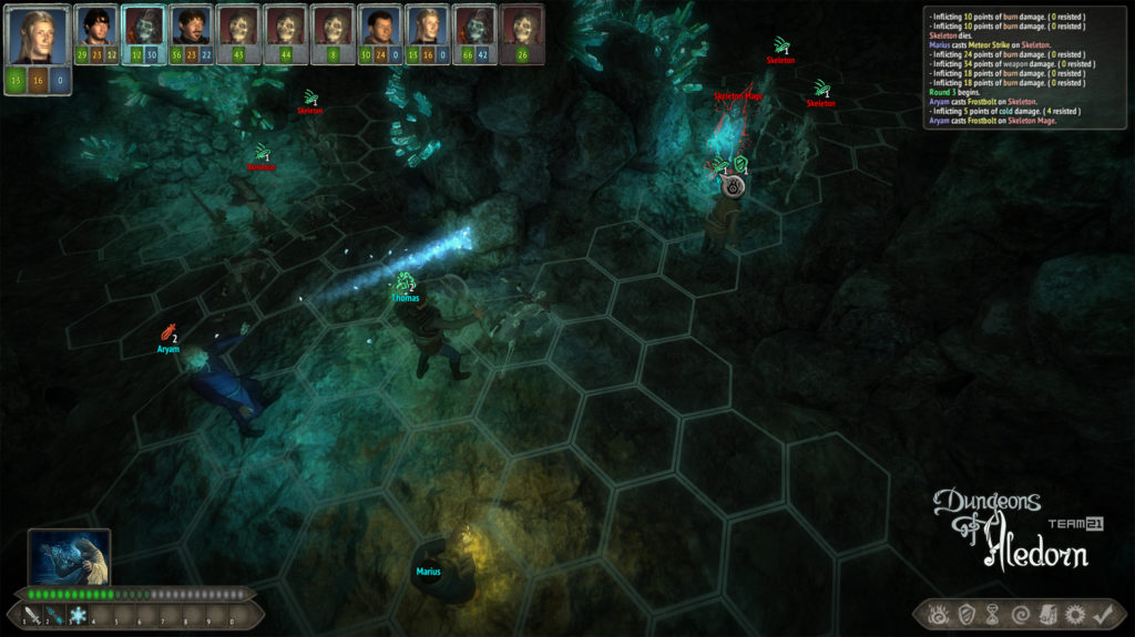
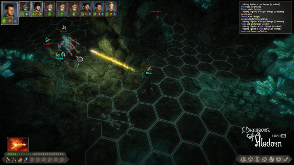
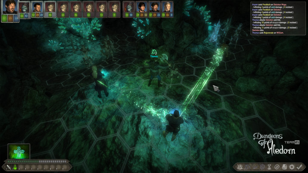
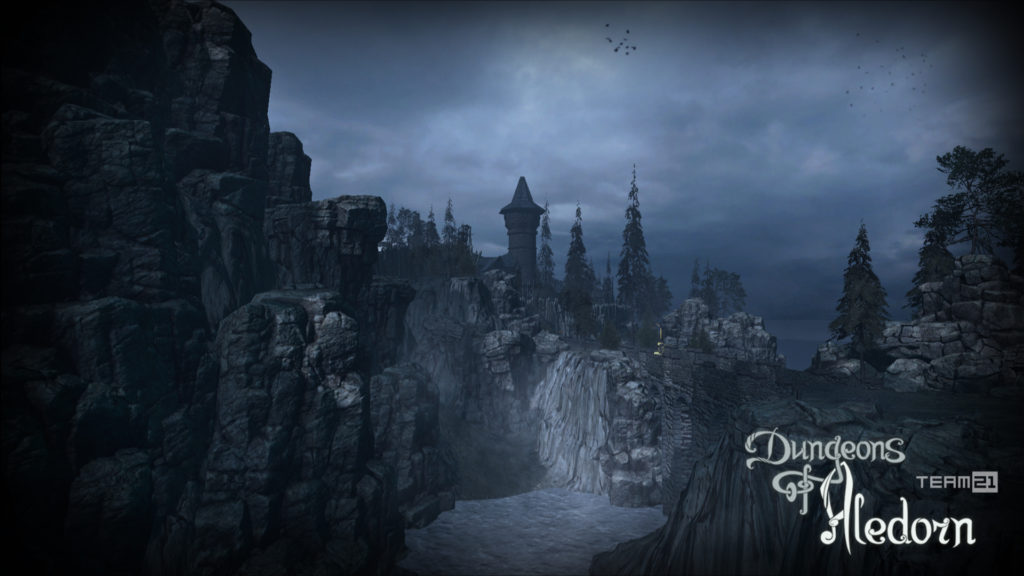
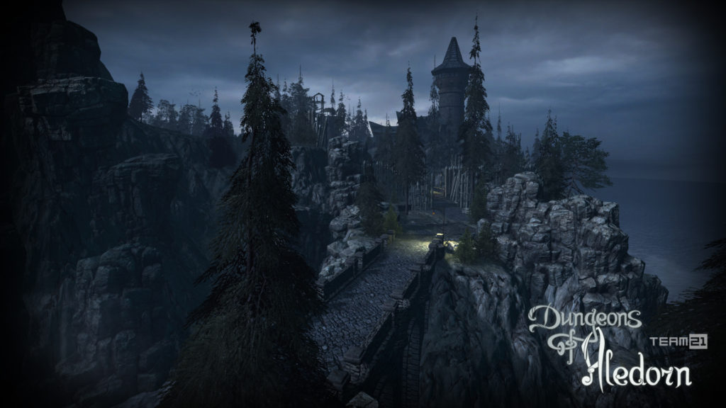
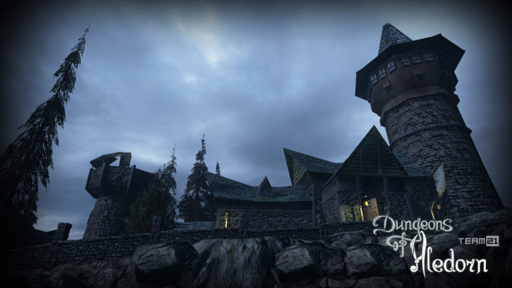
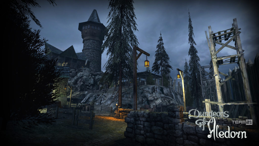
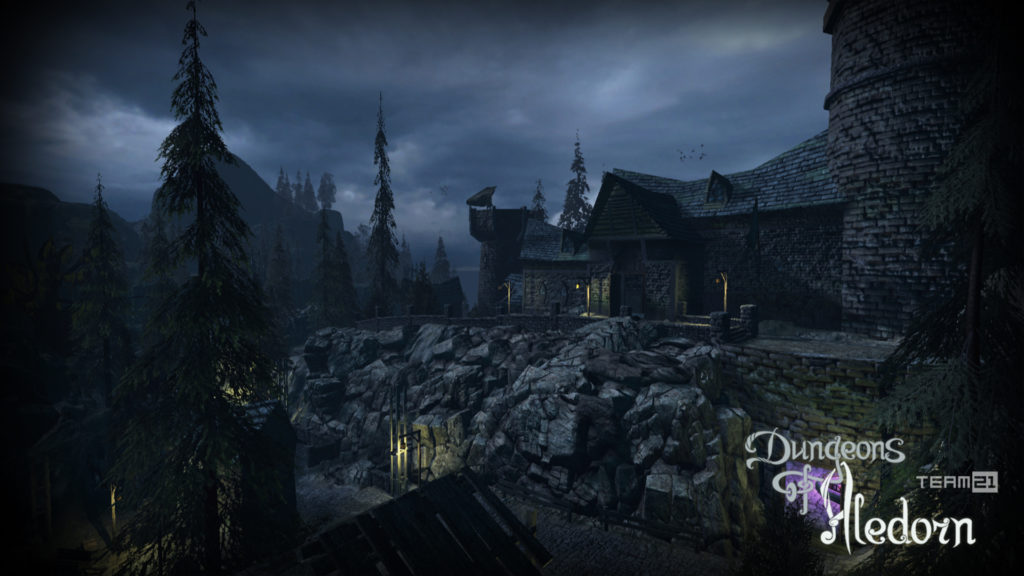
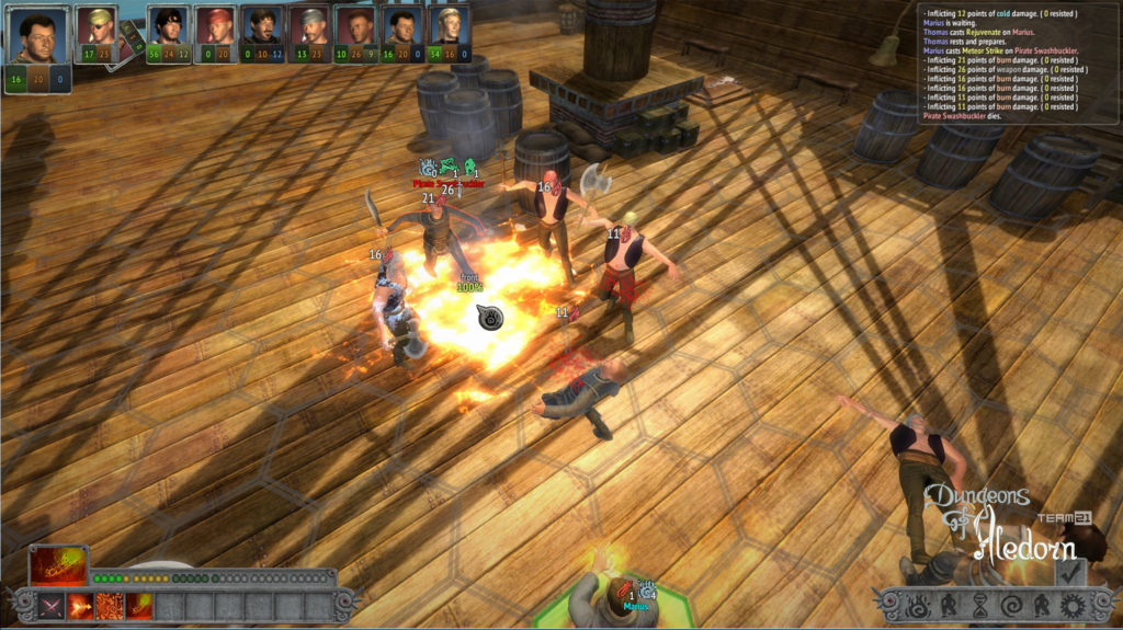
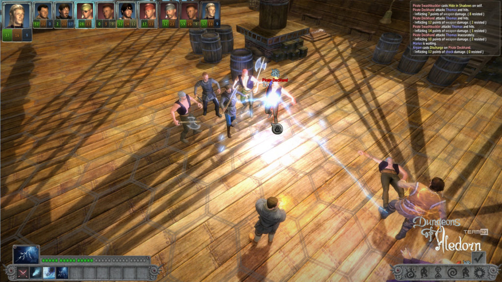
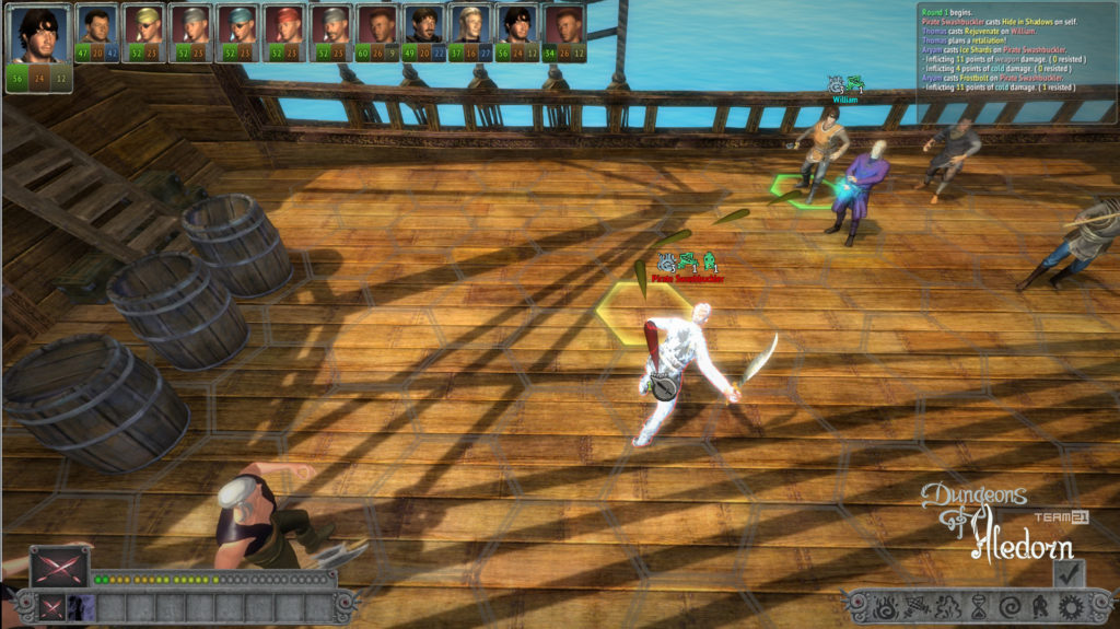
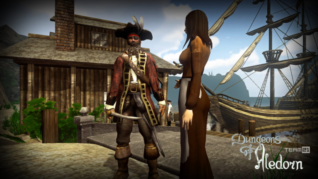
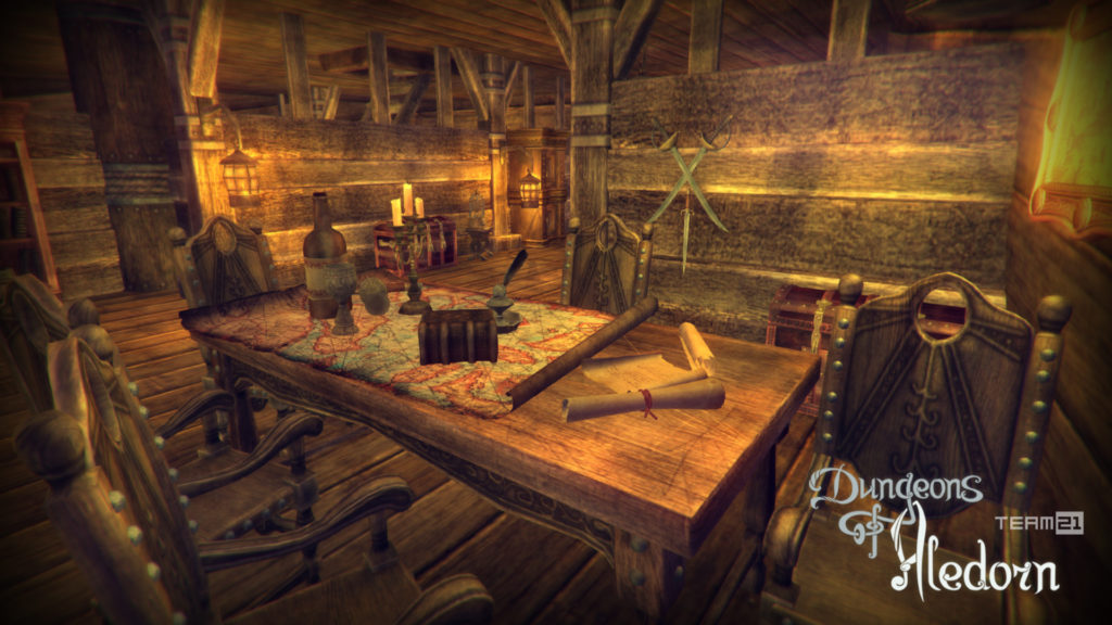
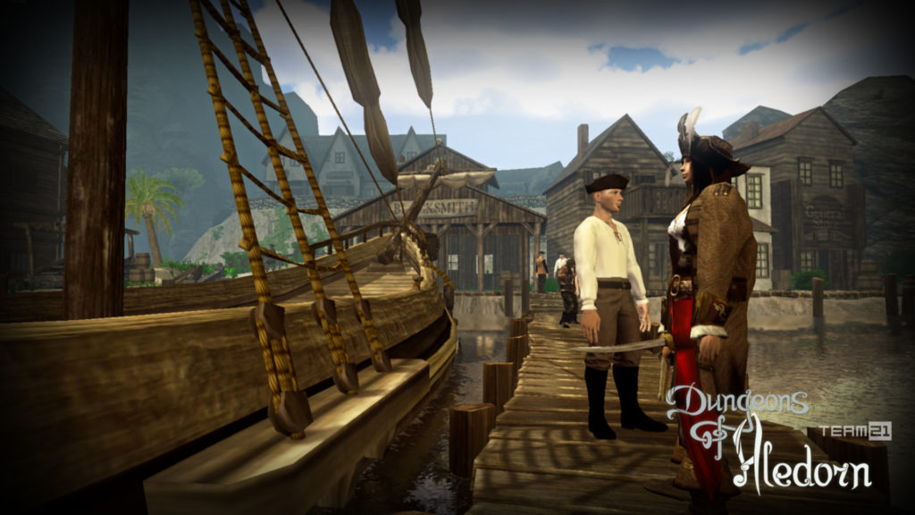
Na závěr si pojďme jako vzpomínku ukázat snímky z této hry, které aspoň tak navždy zůstanou jako připomenutí tohoto krásného projektu, který skončil kvůli lidské chamtivosti neschopnosti dohody.
Spolek SPAFi, předseda
Dear supporters of our association and the Czech RPG computer game Dungeons of Aledorn,
It is with great regret that I must inform you that the development of the game had to be discontinued in March 2024 for financial reasons, and the game will remain unfinished.
However, it would be a shame not to remember the entire history of the game, including all its significant milestones.
The game Dungeons of Aledorn (DoA) initially emerged as a fragmented idea from several different people, with no actual implementation—only various ideas were generated. This phase can be described as mere brainstorming. It wasn't until early 2014, under the wing of the civic association SPAFi (later the SPAFi association), as the sole producer of this project, that serious and intensive work on DoA began. TEAM21 s.r.o. collaborated with us as a service partner. From the very beginning, the idea for DoA was an independent and enthusiastic project, a collective work of passionate creators who wanted to do more than just talk about what they liked—they wanted to actually create it.
At first, it was just a beautiful dream. As mentioned above, overcoming numerous difficulties was necessary, but from the beginning of 2014, intensive work on the realization began, and from 2015 to 2018, up to dozens of enthusiasts from around the world were involved in the development of DoA. It was truly wonderful to watch as this beautiful dream gradually began to take shape. With the help of friendly historical reenactment groups, trailers for DoA were created, which had tens of thousands of views on social media. Hundreds of enthusiasts supported the development of the game on the crowdfunding platform Kickstarter, and it is important to mention the dozens of different supporters who worked on the development of DoA for free. The development of DoA was progressing successfully, and at the beginning of 2019, we began considering the release date of an alpha version, covering approximately 10% of the planned final scope of DoA.
However, a very embarrassing situation suddenly occurred. The project everyone had been working on was suddenly missing from the server accessed by all creators. It simply wasn't there; the entire DoA project had disappeared. There is no need to name names here; those interested can find out online who took the unfinished DoA game almost to completion. Suddenly, the development was back to square one; thousands and thousands of hours of work by many people had disappeared, including graphical, musical, and audiovisual works by numerous authors. All members and supporters of the SPAFi association held a meeting to discuss the future of this project. The entire DoA project had been an enthusiastic endeavor from the start, with mutual trust among all participants, and nothing was formalized with contracts; there were no contractual penalties, everything was based on trust, a handshake, and personal honor. Unfortunately, this trust proved to be misplaced.
And suddenly, it seemed luck smiled on us again. One of SPAFi's long-time members, the legendary Czech producer Jiří Jurtin, who was behind the extraordinarily successful film Lída Baarová, stepped in to lead the project. He was knowledgeable in both art and business, skilled in creative management, and familiar with authors' and licensing rights. Additionally, Jiří Jurtin came up with a truly original and unique idea that we didn't want to publicize for fear it might be stolen again. It was a concept combining film and computer games. Jiří Jurtin proposed that a feature film, lasting 60 to 90 minutes, would serve as the story's exposition, and at a certain point, the viewer would take on the role of a player, seamlessly transitioning the story from a film format to a computer game. Once again, we experienced that initial enthusiasm, and in March 2022, after a forced two-year COVID hiatus, it looked like we would soon begin implementation. Unfortunately, another tragedy struck; in September 2022, Jiří Jurtin died under tragic circumstances, and once again, we found ourselves at an impasse. The Czech film industry is quite an exclusive community, and starting as a newcomer is not easy. Without Jiří Jurtin's irreplaceable contacts, it was impossible to penetrate this field, so at the end of 2022, the DoA project was reworked into a purely computer version.
However, the project's work began to lose its appeal to all participants, and we continued only out of moral responsibility to the dozens of supporters who had contributed or participated in any way in the realization of DoA. We revised the story, adjusted the method of implementation, and to some extent started again from scratch. Unfortunately, over time, we realized that this task was truly enormous. Although Jiří Jurtin had managed the association's finances excellently and left reserves, these quickly dwindled. In March 2024, we had to admit what we had suspected for several months: we don't have the resources to finish the game, we can't find an investor, and from a human perspective, we no longer have the strength to continue with the project.
The fate of the DoA game could be summarized in a few sentences: the selfishness of a few individuals disrupted the realization, and it was no longer humanly possible to complete it. To illustrate this situation in a way almost everyone can understand, we can compare it to a film scenario. It's like a cinematographer claiming all the footage as his own a few weeks before the premiere during the final post-production phase, arguing that since he operated the camera, all the shots belong to him. Yes, the cinematographer may have operated the camera, but without the cooperation of dozens of people, he would have filmed nothing. Without the director and his assistants, no one would know what to do; without actors, the scene would be empty; without costume designers and makeup artists, the actors wouldn't look right; without producers, there wouldn't be any money for all of the above. And this is exactly the case with the computer game. The metaphorical cinematographer who claimed everything is someone who not only doesn't hide this shameful act but publicly discusses it. He is even attempting to complete and distribute the DoA project under the original name Aledorn.
If any of you are interested in honestly and sincerely finishing the Dungeons of Aledorn game without exploiting the thousands and thousands of hours of work by everyone involved, please contact us.
In conclusion, let us look at some images from this game as a reminder of this beautiful project, which ended due to human greed and the inability to reach an agreement.
SPAFi Association, Chairman